

Stuck for ideas on how to use colour in your new home? Let our colourways series inspire you! This month we’re focusing on purple. Not only is it a favourite of Juliet Mourino from our Marketing team but it also matches our branding! Here’s how our interior design partners, Edward Thomas Interiors recommend incorporating the colour that packs a punch…
What interior design styles is purple a good base colour for?
From an interior design perspective, purple can be quite divisive, a bit ‘marmite’ if you will. It’s bold and impactful, so it depends on how you style it.
Traditionally, the classic shades of purple (royal, violet, electric) are associated with royalty, wealth and rarity. For home styling that follows one of this year’s most popular trends, dopamine décor, these purples are a must. Dopamine décor is all about interiors that bring joy, that deliberately clash and are eclectic. We suggest starting with a statement piece, maybe a chair or a headboard, and build your look from there.
Of course, purple is also known as a stabilising colour that promotes wellness and creativity. For interiors with a botanical bias, look to the softer shades such as lavender, lilac, periwinkle and mauve, anything that appears in nature. These also make fantastic prints or patterns, especially for wallpapers, murals or artwork.
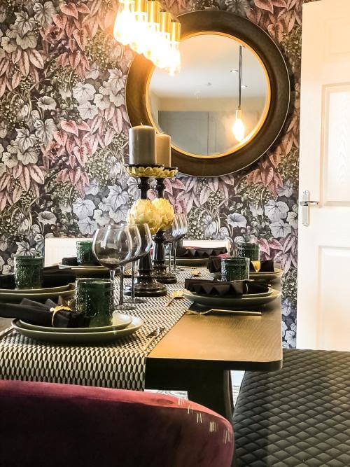
Finally, if a more autumnal aesthetic is what you’re aiming for then don’t discount your fruits! Plum, grape and mulberry all make for rich, elegant interiors and are great for adding some drama to your décor, especially in formal dining rooms.
What colours can be paired with purple?
Purple actually makes a great companion for a wide variety of colours and materials, especially if used as an accent. If you’ve opted for one of the bolder or richer shades, then metallics such as gold or copper will pair well for a regal look.
If your styling is more natural and using a botanical palette, these match well with various greens (see our previous blog on going green), however if you’re feeling bold, then 2025 is supposed to welcome the lilac/lemon combination so this is another option!
Lastly, purple and monochrome make a great contrast. Black and purple gives an edgy, atmospheric vibe while mixing purple with white can add a calming, restorative ambience.
How can I use purple in different rooms?
Bedrooms are one of our favourite places to use purple. The softer, pastel shades such as periwinkle or mauve can create cosy guest bedrooms; lilac or lavender combined with whites or neutrals make beautiful nurseries; or why not follow the cyberpunk trend and make a statement teenage bedroom with electric purple and some neon!
If you don’t want to go for the whole room, then try purple as part of your wallcoverings e.g. as half and half panelling, or on your door, window or fireplace surrounds as a pop of colour.
Our top 3 most versatile shades of purple:
Plum, lilac and mulberry.


